
The WordPress blog layout that works has two jobs and a different shape for each. The first screen sells the blog: featured posts, a quiet strip of the rest, and one way onward. The feed below it is for reading, and for most posts that means list rows with the image on the left and the text on the right, with grids kept for sections where pictures or video lead.
I have been building blog templates for about ten years, and I can tell you plainly which blog layouts work and which do not. Most of your readers and leads are won or lost on that first screen, so start there.
- First screen
- Three parts: featured, the rest, a way onward
- Main feed
- List rows, image left, text right
- Grids
- Category sections and media-led cards
- Sliders
- Calm, pausable, never moving on phones
- Reading column
- About 50 to 75 characters a line
This assumes you have already picked WordPress as the platform. If you are still choosing, start with the comparison below.

Which blog layout fits which posts?
Pick the layout for each part of the blog by what fills it. A blog page layout is a set of sections, and each section has its own kind of content: a few lead stories, a long run of regular posts, a category with strong photos, a video series. The right blog layout for one of them is often the wrong one for the next.
| Layout | What it suits | Where it goes |
|---|---|---|
| Featured block or slider | Three to five lead stories | Top of the first screen |
| List rows (image left, text right) | The bulk of your posts | Main feed, archives, search |
| Grid of cards | Photo, video and gallery posts | Category sections, media series |
| Single column, text first | Essays, a personal journal | Small blogs with few images |
| Magazine (mixed zones) | Many categories, daily output | Front page of a busy site |
Showing summaries rather than whole posts on the blog page is the safer default. In a Nielsen Norman Group eyetracking study of blog front pages, readers shown full articles scanned the first one and looked no further, while a run of summaries exposed them to more topics and so more chances to find something they wanted.
What goes on the first screen of a blog?
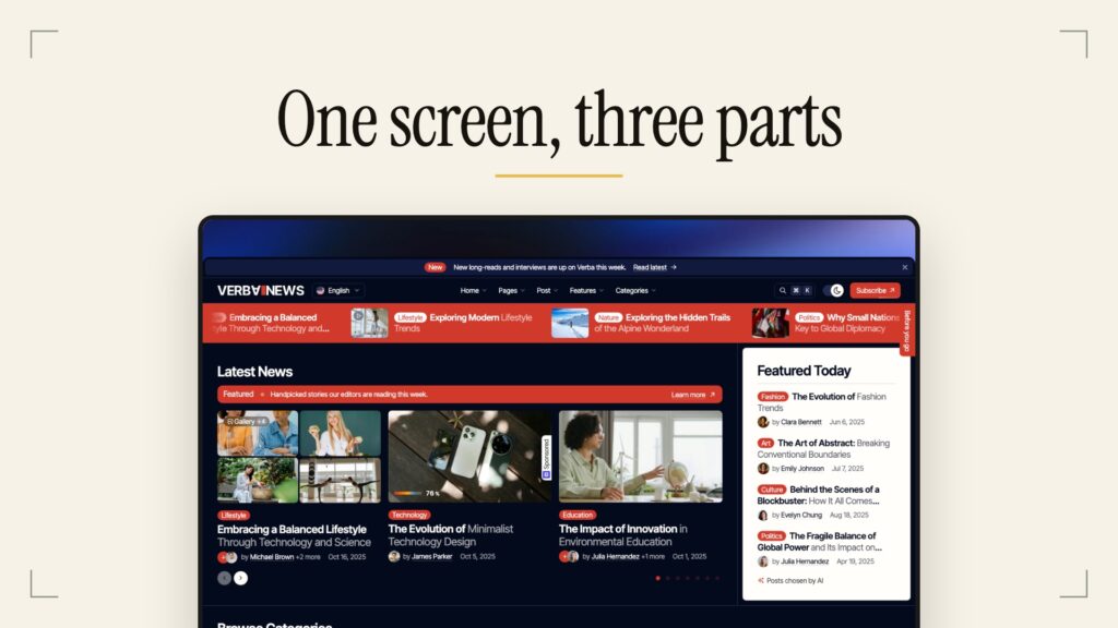
The first screen of a blog almost always needs three parts: a featured section, a quiet listing of the rest, and one way onward. Most of your leads and readers depend on this screen, because it is the one part of the blog every homepage visitor sees. Use the three parts below as blog design ideas to check against your own homepage.

Part one: featured posts, set calmly
The first part shows your featured posts in the most attractive, most prominent section on the page. It can be a carousel or a good modern slider, as long as it has strong typography and no extra effects or controls nobody needs. The era of flying, flashing sliders and WebGL carousels stayed back in the CodePen days, with the few enthusiasts who spent weeks on those effects, and back then they really did show something. Today, sorry, but let me read the damn headline without needing a pill afterwards.
Part two: a quiet strip of the rest
The second part is a small ticker or a query listing that shows the mass of your posts without shouting. Make it the latest posts, or random posts if your blog is mostly evergreen and kept up to date, or one specific category that works quietly inside the first screen. Its job is to prove the blog is alive and give a scanner a second chance to find something.
Part three: one way onward
The third part sends the reader somewhere: extra highlight posts such as trending today, the categories that lead straight into one part of the blog, or a newsletter signup that grows your email list. Pick one. Three ways onward on one screen turn into a wall of boxes that nobody reads.
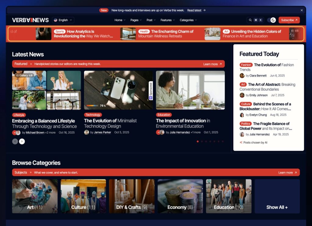
For a real example, the News demo of our Verba theme is built exactly this way: a featured slider of the editors’ picks on top, a ticker of the latest pieces across the head of the page, and a row of categories that leads straight into one part of the blog.
Should a blog homepage have a slider?
A blog homepage can have a slider, if it stays calm: it never moves by itself on phones, it can be paused, and the first slide carries the story most readers want. If you cannot meet those rules, a static lead story with two or three smaller ones beside it does the same job with less risk.
The research is old but consistent. In a Nielsen Norman Group test of auto-forwarding carousels, a shopper missed a discount offer at the top of the page because the panel kept rotating away before she read it, and she concluded the store had no deals. Baymard Institute found usability issues on 46% of the desktop and mobile ecommerce sites with a homepage carousel in its benchmark, and notes that most people never see past the first slide. And under WCAG 2.2 success criterion 2.2.2, anything that moves on its own for more than five seconds needs a way to pause, stop or hide it.
- No autoplay on phones. Baymard advises against autorotation on mobile, where there is no hover to hold a slide still.
- On desktop, slow and pausable: about 5 to 7 seconds a slide, a pause on hover, and a full stop once the reader changes a slide by hand.
- Controls you can see at a glance, with enough contrast against the photo behind them.
- The strongest story on slide one, because that is the slide most visitors see.
- No effects that hide the headline: no WebGL warps, no parallax under the title, no text flying in.
List or grid: which layout works for most posts?
For the main mass of posts, a list with the image on the left and the text on the right almost always works better than a grid of cards. It is the more natural layout because it follows how people read, left to right along a line, while a grid makes the eye jump up and down between columns. So the best blog layout for your regular cards is the list: make roughly 70% of them list rows, and keep the grid for the rest.
In Nielsen Norman Group eyetracking research from 2017, 80% of fixations fell on the left half of the screen, up from 69% in their earlier study. A list row puts the picture where the eye lands first and the headline right next to it, on the same line. A grid splits the same attention across two or three columns, and each card gets a narrow headline that wraps into three or four lines.

The grid still has a job. Use it for a section of one category, and for cards where the media comes first and the text second: video posts, galleries, photo essays, recipes where the dish sells the click. There the picture is the content, and a grid shows more pictures in less space.
Sidebar or no sidebar?
A blog sidebar earns its place on the homepage and in archives when it routes readers: categories, search, a newsletter form, the posts trending now. On the single post page it competes with the text, so our view is to keep it light there, or drop it. On phones a sidebar falls below the content anyway, so nothing important should live only in it.
If a widget does not send the reader to another post or to your list, it is decoration. Tag clouds, calendars, long archive lists by month and badges from 2012 can all go.
How wide should a blog post be?
A blog post layout reads best at about 50 to 75 characters per line, the range Baymard Institute recommends for body text, with body type somewhere between 15 and 25 pixels, as Practical Typography suggests for the web. Lines longer than that make the eye lose its place on the way back; shorter ones break the sentence every few words.
In a block theme this width is one setting: settings.layout.contentSize in theme.json sets the default width of the content, and wideSize sets the width for wide images, according to the WordPress theme handbook. Let images go wide or full width, and keep the text in the narrow column. The column you are reading now is 640 pixels wide for exactly that reason.

How to set up a WordPress blog layout
You set up a WordPress blog layout in three places: Settings for which page shows the posts, the Site Editor for the template, and the Query Loop block for each listing. A theme with its own listing settings can replace the last two.
Pick the page that shows your posts
In Settings, Reading, set Your homepage displays to A static page, then choose a Homepage and a Posts page; they cannot be the same page. Blog pages show at most sets how many posts appear per page. The posts page ignores any page template you give it: per the template hierarchy, WordPress draws it with the home template, or index when there is none, and block themes use the same order with HTML files.
Edit the Blog Home template
On a block theme, go to Appearance, Editor, Templates and open Blog Home (or Index, if your theme has no Blog Home). Everything you add here appears on the posts page. Build the three first screen parts at the top, then the feed.
Build each listing with the Query Loop
- Add a Query Loop block for the featured part. Set Query type to Custom, Sticky posts to Only, and Items per page to three to five. Mark those posts as sticky in the post editor.
- Add a second Query Loop for the feed. Set Sticky posts to Exclude so the featured posts do not repeat. If your featured part simply shows the newest posts instead, use Offset to skip them.
- Select the Post Template inside it and choose List view in its toolbar. Add a Columns block inside the template, put the Featured Image in the left column and the Title, Date and Excerpt in the right one.
- Turn on Make title a link on the Title block and Link to Post on the Featured Image, or the cards will not click through.
- For a category section, add another Query Loop, open Filters, choose the category under Taxonomies, and switch the Post Template to Grid view.
- Keep the Pagination block under the feed so older posts stay one click away.
Or let the theme do the work
A blog theme can do all of this from settings instead of blocks. In our Verba theme, for example, one post listing serves the front page, archives, related posts and menus; grid, list, slider, carousel or ticker is a setting, cards can be card, list or overlay, and each category and author picks the post that stands at the top of its own archive. Whatever theme you use, check that it lets you set a different layout for each section of the blog.
Blog layout questions
What is the best layout for a blog?
For most blogs, the best layout is a three part first screen (featured posts, a quiet strip of the latest, one way onward) followed by a feed of list rows with the image on the left. Grids work for media-led sections, and a narrow reading column of about 50 to 75 characters works for the posts themselves.
How do I change the default posts page in WordPress?
Go to Settings, Reading, choose A static page under Your homepage displays, and pick the page you want in the Posts page menu. Its look comes from the Blog Home template in the Site Editor, not from the page itself.
Does WordPress have blog templates?
Yes. Block themes ship templates such as Blog Home, Index, Archive and Single, and you edit them in Appearance, Editor, Templates. The Query Loop block also comes with ready-made list and grid patterns from your theme.
Should the blog page show full posts or excerpts?
Excerpts, in most cases. Summaries let readers scan many topics on one screen; full posts on the blog page make sense mainly for a short personal blog whose readers come back for every new entry.
What to do next
Open your blog on a phone and look only at the first screen. Count the parts: if you cannot point to the featured posts, the strip of the rest and one way onward, fix that first. Then switch your main feed to list rows and see how it reads. If you would rather start from a theme that already does this, browse our blog and magazine themes, or see how this blog lays out its own listings.